Katie Cooks
Background
Kraftvrk is a CrossFit gym based in Copenhagen, who recently embarked on the process of expanding their business while exploring the fitness clothing market.
Branding
The Kraftvrk team were in the process of expanding their social presence when I was asked to create a new visual identity for them.
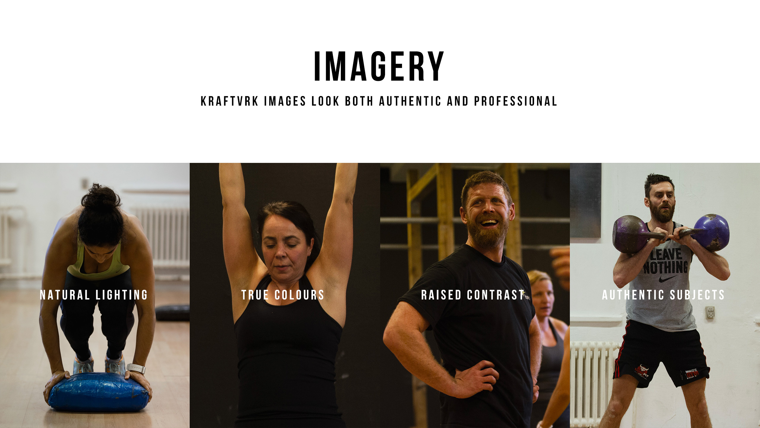
I produced an identity based on a simple colour palette of black and white, supported by muted secondary tones, coupled with strong typography to convey a feeling of strength, appropriate for the physical nature of the company's activities. Combined with imagery taken from workout sessions at their gym in Copenhagen, this simple approach reflects Kraftvrk's values, while giving an authentic view of the work they do.
Kraftvrk branding

Kraftvrk branding
Brand guidelines - Cover page
Kraftvrk branding
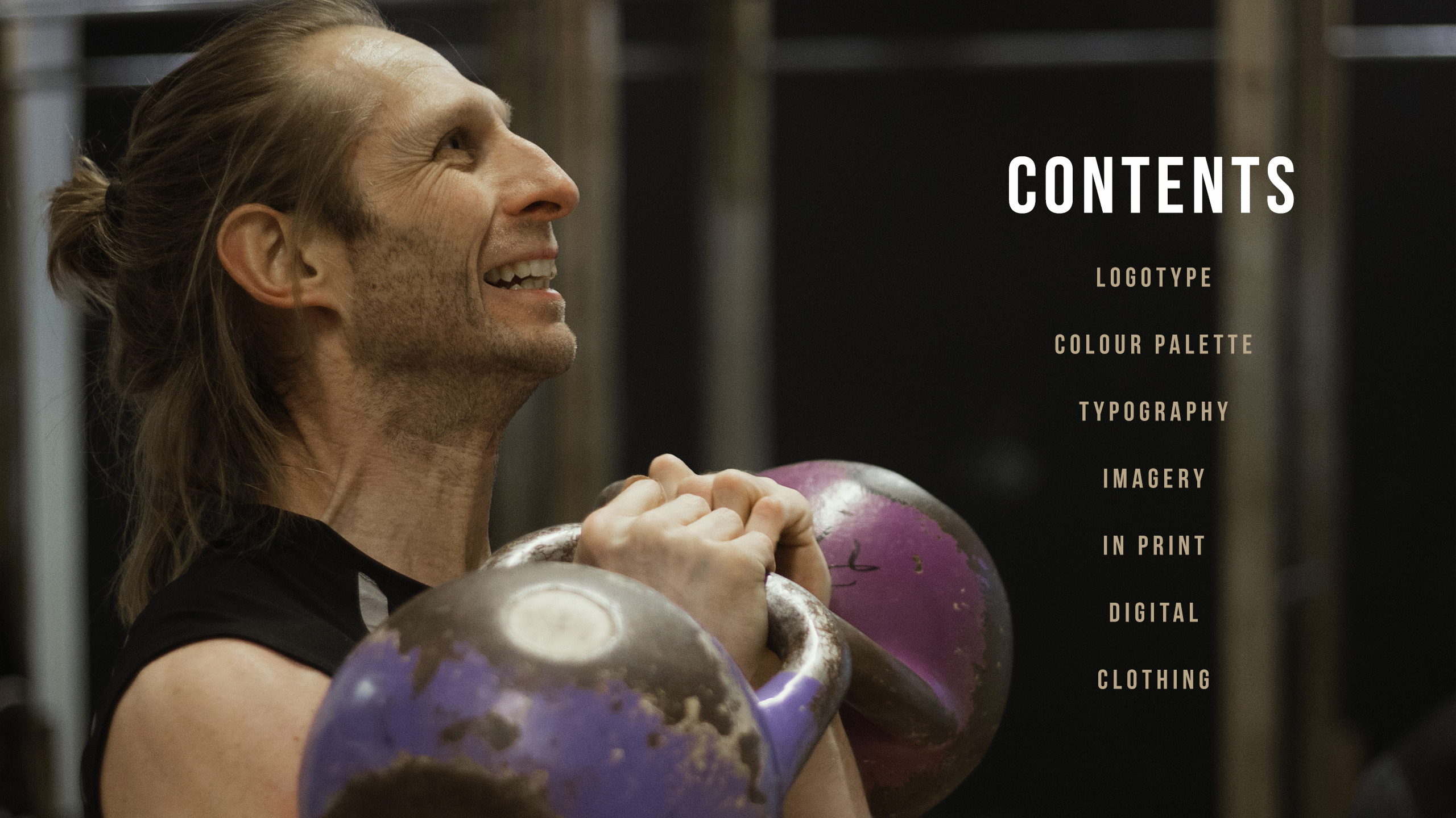
Brand guidelines - Contents

Kraftvrk branding
Brand guidelines - Logotype

Kraftvrk Branding
Brand guidelines - Logo usage

Kraftvrk Branding
Kraftvrk Brand guidelines - Logo usage (Social profiles)

Kraftvrk Branding
Brand guidelines - Colour palette

Kraftvrk Branding
Brand guidelines - Typography
Kraftvrk Branding
Brand guidelines - Imagery usage guide

Kraftvrk Branding
Brand guidelines - Printed assets

Kraftvrk Branding
Brand guidelines - Website

Kraftvrk Branding
Brand guidelines - Instagram profile

Kraftvrk Branding
Brand guidelines - Example newsletter

Kraftvrk Branding
Brand guidelines - Clothing range

Kraftvrk Branding
Brand guidelines - Rear cover
